 Adam
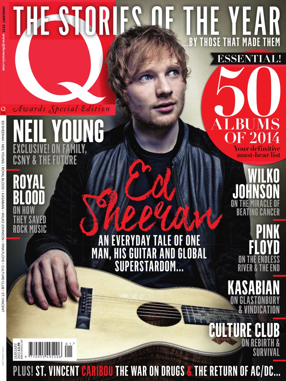
AdamQuestion: 'What do you think about this front cover of 'Q' magazine?

Adam: I think it looks quite appealing, mainly because all the colours match. The use of red makes it eye-catching. I also think it is effective that he isn't looking at the camera, because usually on magazines the artist on the cover is looking in the camera.
Sydney
Question: What do you think of the front cover for this magazine, 'NME'?

 Sydney: It doesn't look very appealing to me. I think the use of a bright yellow at the top, while it does stand out, makes it look a bit too overwhelming. Like, the odd use of yellow here and there works, but I think it's too much. It fits the genre of indie though, especially the black and white picture.
 Holly
Question: What is your opinion on the cover of this magazine, 'Billboard'?

Holly: I like the cover of this magazine, and I find it appealing. I think it's relevant that the artist is covering most of the masthead, as it shows its popularity. Her angle of gaze is away from the camera, so I think that is a pose used a lot on indie music magazines, as I have seen it used before. The colours match, making it look attractive.
I then continued to ask them some general questions about the magazines I had showed them.
1. Would you buy one of these magazines? If so, which one?
Holly: I would definitely buy the first one, not just because it has Ed Sheeran on it, but also because I like the colour scheme best. I think red, black and white stands out the most, which makes it appealing to me.
Sydney: I would buy the first or last one. I think the colours work best on them, and while they are both really different, I think they both work. I especially like the last one though because it is quite simplistic but looks nice.
Adam: I would probably buy the first one as well. The colours make it most appealing and it is layout well.
2. What features on the magazine 'NME' stood out most to you?
Adam: The first thing I noticed was the artists name. It's written in big capital letters, which made it hard to miss. I think because the picture is in black and white, and the font is against the black, it made it stand out more.
Holly: The bright yellow banner at the top, for sure. Because its so bright and stands out from the mostly red and black colour scheme, it makes it stand out from the rest of the magazine.
Sydney: The same as Holly really, the yellow banner stood out most to me. As soon as I saw the magazine, that was the first thing my eyes went to.
3. What makes the third magazine, 'Billboard', appealing, if anything does?
Sydney: I just really like how simplistic it is. It gives away little information, which could go both ways in making someone want to buy it, but I personally prefer that.
Holly: I personally don't find it very appealing. While the layout works, I don't think it's stuck to a strict theme and colour scheme, and I prefer magazines that do. The writing is also quite hard to read against the outfit the artist is wearing.
Adam: The picture on the front is used effectively because she is looking away from the camera, but apart from that I think it is too simple.
4. How do these magazines fit in the indie genre?
Adam: The two colour schemes on the first two are red and black, and I think that makes them fit the genre because those are the colours I would expect to see on the front of an indie magazine.
Sydney: I think they all fit the genre well. The last one is quite different to the other two, but I still think it works, because I associate Indie music with both ways the magazines look; with guitars and colours like the ones used, but also like, aesthetics and flowers.
Holly: They all fit the indie genre as they are not what you would see in mainstream magazines; two out of three of the magazines, the artists are looking away from the camera and none of them are smiling. Usually you would see the opposite of this on magazines.

No comments:
Post a Comment