Sunday, 31 January 2016
Friday, 29 January 2016
Saturday, 16 January 2016
Taking Pictures
Here is a video of some photos of me taking photos of my model. I used a variety of props, shots, angles and zooms to create my test shots, and came out with a good selection. (Photo credits to Holly Hawkins-Lucraft)
Made on stupeflix.com
Friday, 15 January 2016
Test Shots
Here is a video I made on stupeflix.com of all of my test shots for my front cover, contents page, and double page spread. I have varied the types of shots I have used and the props I have used as well, using one or the other, none, or both.
Flat Plan Feedback
To receive feedback for my flat plan, I asked a number of my peers their opinion and received comments on the post for my flat plan. Overall, the vast majority of comments and feedback I got was very positive and my design and layout was appreciated.
Holly mentions here that she liked my idea to have the translucent L on top of my article as it shows the artist. I thought this would be a good idea as it also makes her name stick in your mind, and it also looked attractive.
Again, people here have mentioned the idea for the L as well as the colour scheme being an interesting idea. Somebody also mentioned the title of my magazine which pleased me as I was worried people would not understand it, but I chose the title as it relates to music but not in a way that is too obvious.
From my peers, I received similar feedback. Overall, people seemed to like that I chose to keep my layout simple but creative, and the colour scheme was also something people found interesting. I thought that the idea I had for the colour scheme would impress as it is different and not something you see on magazines often. The only advice and criticism I got was to make sure I left enough space at the top of my photo for the masthead to go, as it was quite cramped on my flat plan. When taking my test shots, I took this into consideration.
Thursday, 14 January 2016
Sunday, 10 January 2016
Visual Mood board
This is my visual mood board I made. I included seven different things I associated with the Indie genre, which is records (vinyls), instruments, checked shirts, vintage things, CDs, accessories and art. To produce my mood board I used a range of different angles when taking photos, as well as filming some of my footage. The music I used is Twenty One Pilot's Tear In My Heart as I found it was fitting as they are an indie band and kept the energy of the video up.I will use what I have learnt through making this video and apply it to my photos and elements of my magazine through props, colour schemes and more.
Saturday, 9 January 2016
Artist Profile - Fashion
These are some of the items of clothing/accessories that I have collaged on picmonkey.com, to show the type of clothing my artist would wear. I have taken inspiration and ideas from them so that I can use the style and some similar items of clothing on the model I have chosen to be my artist. All of the clothes and accessories on here fit the indie genre, some leaning to Indie Rock while others to Indie Pop. However, they both fit how I picture my artist to look and the type of clothes they would wear. While these items of clothing are popular, it is not mainstream popular, but mostly among artists in the genre and fans of the genre. I noticed that usually female Indie artists wear either very grunge, bohemian types of clothing, such as Lana Del Rey and HAIM, while others are more quirky and eccentric in their fashion, such as artists like Melanie Martinez and Marina Diamandis. By doing this research, I have found out that I can chose to style my artist either one of these ways, or stray from both to create a new style for the genre.
Friday, 8 January 2016
Tuesday, 5 January 2016
Audience Research - Focus Group
 Adam
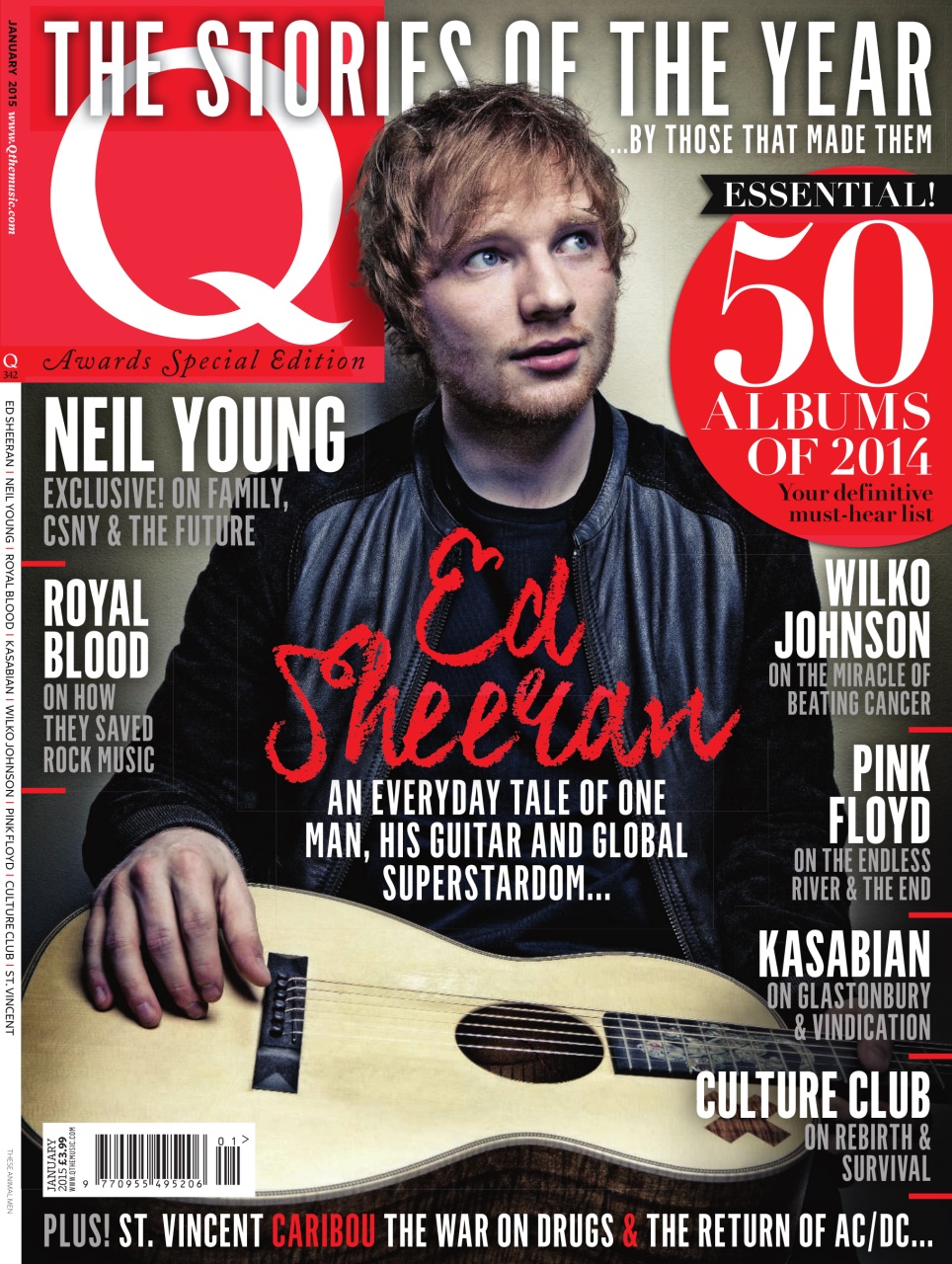
AdamQuestion: 'What do you think about this front cover of 'Q' magazine?

Adam: I think it looks quite appealing, mainly because all the colours match. The use of red makes it eye-catching. I also think it is effective that he isn't looking at the camera, because usually on magazines the artist on the cover is looking in the camera.
Sydney
Question: What do you think of the front cover for this magazine, 'NME'?

 Sydney: It doesn't look very appealing to me. I think the use of a bright yellow at the top, while it does stand out, makes it look a bit too overwhelming. Like, the odd use of yellow here and there works, but I think it's too much. It fits the genre of indie though, especially the black and white picture.
 Holly
Question: What is your opinion on the cover of this magazine, 'Billboard'?

Holly: I like the cover of this magazine, and I find it appealing. I think it's relevant that the artist is covering most of the masthead, as it shows its popularity. Her angle of gaze is away from the camera, so I think that is a pose used a lot on indie music magazines, as I have seen it used before. The colours match, making it look attractive.
I then continued to ask them some general questions about the magazines I had showed them.
1. Would you buy one of these magazines? If so, which one?
Holly: I would definitely buy the first one, not just because it has Ed Sheeran on it, but also because I like the colour scheme best. I think red, black and white stands out the most, which makes it appealing to me.
Sydney: I would buy the first or last one. I think the colours work best on them, and while they are both really different, I think they both work. I especially like the last one though because it is quite simplistic but looks nice.
Adam: I would probably buy the first one as well. The colours make it most appealing and it is layout well.
2. What features on the magazine 'NME' stood out most to you?
Adam: The first thing I noticed was the artists name. It's written in big capital letters, which made it hard to miss. I think because the picture is in black and white, and the font is against the black, it made it stand out more.
Holly: The bright yellow banner at the top, for sure. Because its so bright and stands out from the mostly red and black colour scheme, it makes it stand out from the rest of the magazine.
Sydney: The same as Holly really, the yellow banner stood out most to me. As soon as I saw the magazine, that was the first thing my eyes went to.
3. What makes the third magazine, 'Billboard', appealing, if anything does?
Sydney: I just really like how simplistic it is. It gives away little information, which could go both ways in making someone want to buy it, but I personally prefer that.
Holly: I personally don't find it very appealing. While the layout works, I don't think it's stuck to a strict theme and colour scheme, and I prefer magazines that do. The writing is also quite hard to read against the outfit the artist is wearing.
Adam: The picture on the front is used effectively because she is looking away from the camera, but apart from that I think it is too simple.
4. How do these magazines fit in the indie genre?
Adam: The two colour schemes on the first two are red and black, and I think that makes them fit the genre because those are the colours I would expect to see on the front of an indie magazine.
Sydney: I think they all fit the genre well. The last one is quite different to the other two, but I still think it works, because I associate Indie music with both ways the magazines look; with guitars and colours like the ones used, but also like, aesthetics and flowers.
Holly: They all fit the indie genre as they are not what you would see in mainstream magazines; two out of three of the magazines, the artists are looking away from the camera and none of them are smiling. Usually you would see the opposite of this on magazines.
Sunday, 3 January 2016
Friday, 1 January 2016
Fashion/ Image of Indie Artists
Here is a short video I made, analysing the way artists, male and female, are presented in photoshoots/magazines, and what their overall fashion is like. Doing this will help me get an idea of what the conventional poses/clothing is worn by artists, and I can either decide to follow that trend or fill the gap in the market and decide to do it completely differently. It has also given me inspiration and ideas for how I could use these images to help decide on poses/clothing I would want my model to wear.
Subscribe to:
Comments (Atom)


